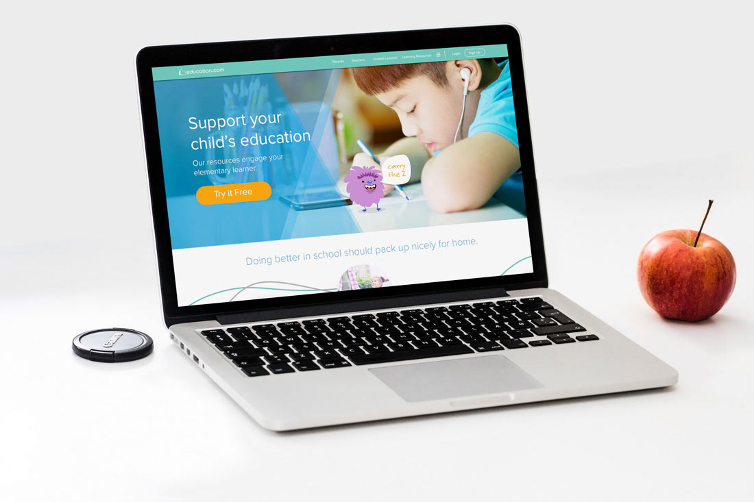
Redesigning a site can be hard. So much research goes into what data is existing and how to maintain a user base while growing into a platform. Leading this process is not always easy and creating a path forward doesn't mean it will work as planned. Parents and Teachers care about kids, and if given the right context, the tools can shine bright. That was my goal.
Pushing the design to communicate value while upholding humanity with the the emotions that drive us.
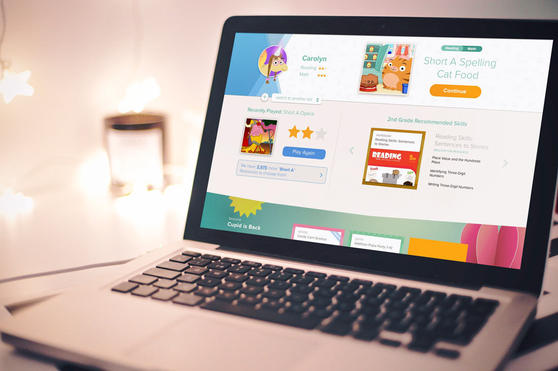
Pages like this are used to simplify the number of interactions that happen on the site. It condenses why I am here, and centralizes what I need to do. Specifically as a Parent I can see what my child has done recently, continue the current lesson, and get recommendations that are seasonal or grade level.
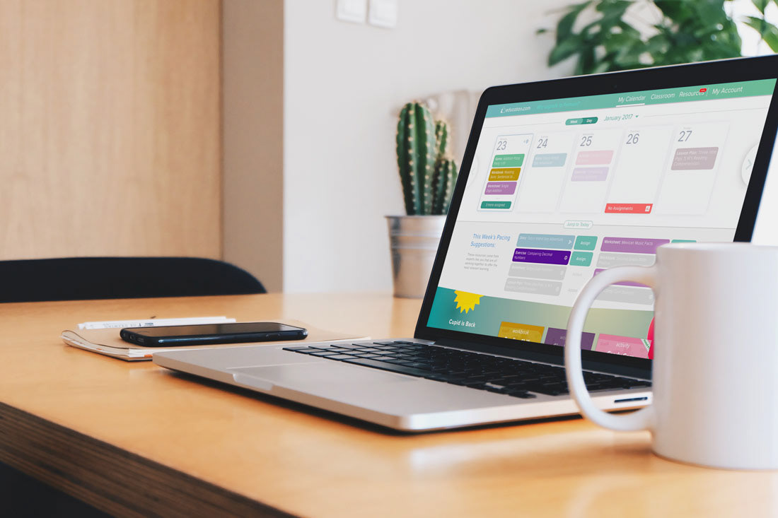
I even got teachers involved in a weekly feedback session and realized the way they use the platform isn't always about the kid, but they need to organize the lessons for time. So the calendar was born. It integrates with notifications so educators can be reminded when to print the necessary resources.
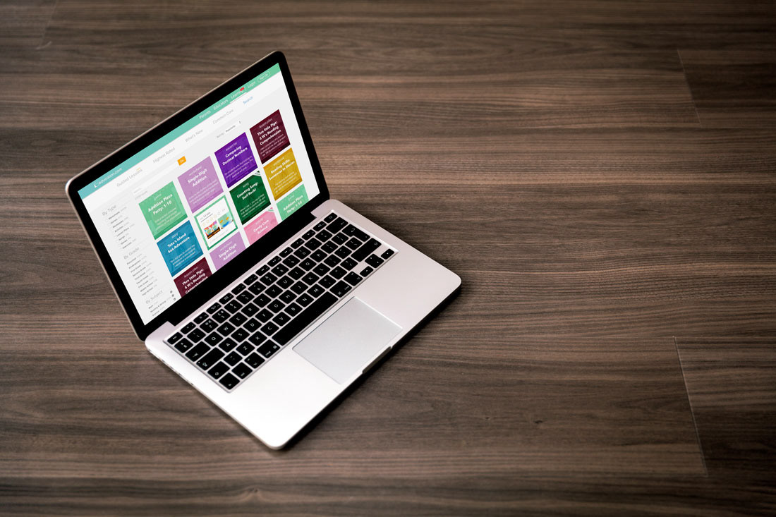
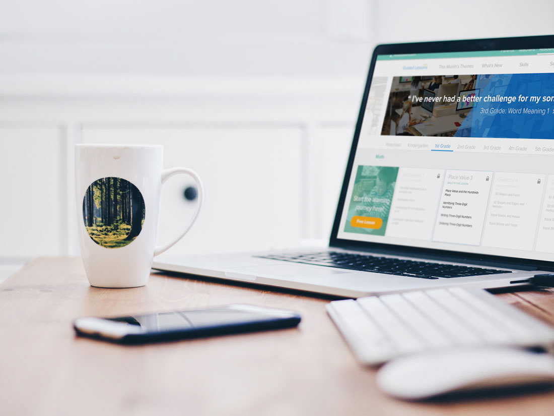
Organizing the content can be hard if you offer tens of thousands of resources. So with a curated guided lesson option users can just click and go to address certain grade level skills. Stealing from great filtered content apps like Netflix and Apple TV, I was able to proposed more relevant featured content based on time of year or even current events.
Last but not least, you want users to search if they really have to. But making sure that experience screams variety and related content means you have to be a little louder. I pushed colored tiles so that people wouldn't get wrapped up in using the same kinds of resources over and over.